User Experience

SXSW 2012 Mobile App Wireframes

SXSW 2012 Mobile App Designs

A couple of weeks ago, I found myself playing around with the official South-By-South-West (SXSW) mobile app, SXSW Go, on my Android device. Great memories came back to me as I viewed my schedule of events and recalled the unwarranted amounts of inspiration, fun and education I got out of SXSW 2011.

However, in playing around with the app, I noticed some opportunities where the User Experience (UX) could've been enhanced. As a result, I conducted some fundamental user research (looking to the app reviews on the Android Market and probing my mates who went to SXSW 2011 with me) and whipped up some high-fidelity conceptual wireframes for the SXSW 2012 app.

Before we begin, I'd like to thank @c0uP@pkattera, @reece_wagner & @jasehutch for their time in the process, either contributing ideas and insight or reviewing the concepts. I'm extremely appreciative to have these guys involved.

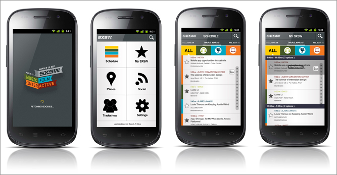
The wireframes below is just a preview of some of the thought that has been put into re-engineering the User Experience for the SXSW 2012 app. Only two user journeys have been explored:

  1. Schedule - The entire SXSW schedule (including the film, interactive and music festivals as well as the tradeshows)
  2. My SXSW - The user's customised shortlist of events they wish to attend

Significant thought has also been put into Places, Social and the Tradeshow, but that's for another discussion.

I'd love to hear your feedback and see what you think!

1. Splashscreen

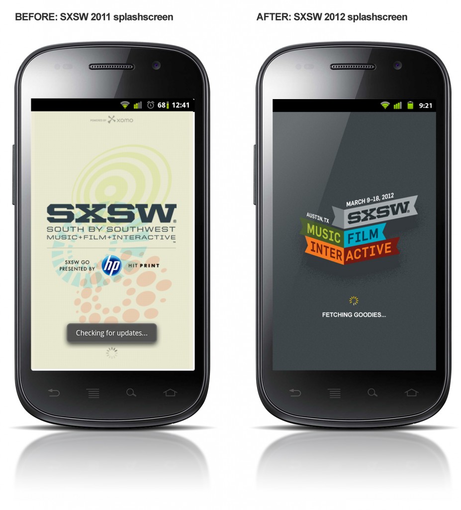
SXSW 2011 / SXSW 2012 Mobile App Splash screens

2. Dashboard Navigation

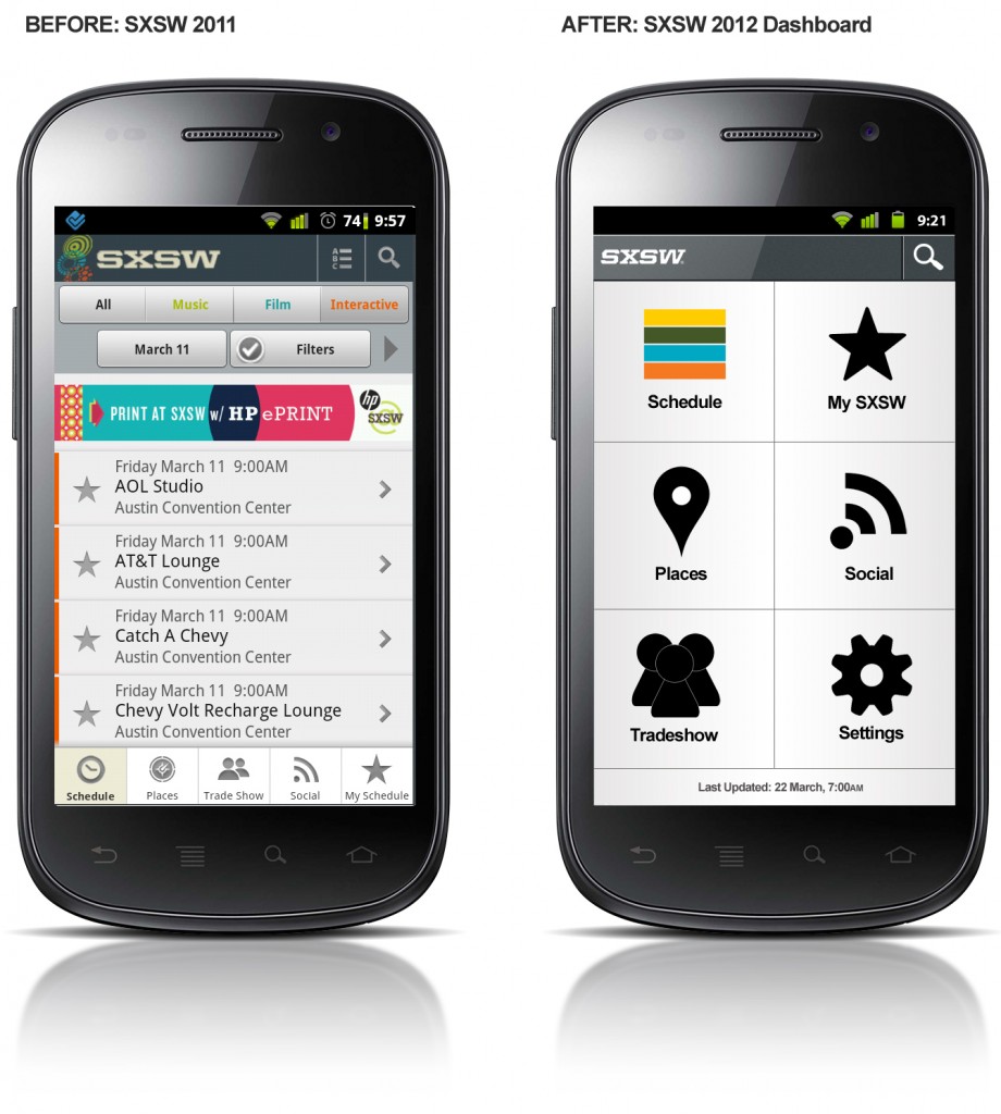
Note: The SXSW 2011 app did not feature dashboard navigation. SXSW 2011 / SXSW 2012 Mobile App Dashboard Navigation

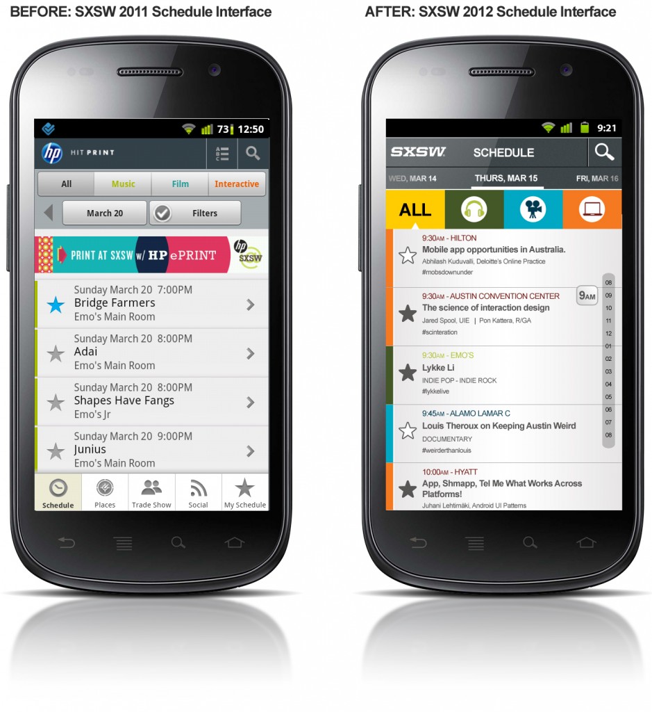
3. Schedule Interface

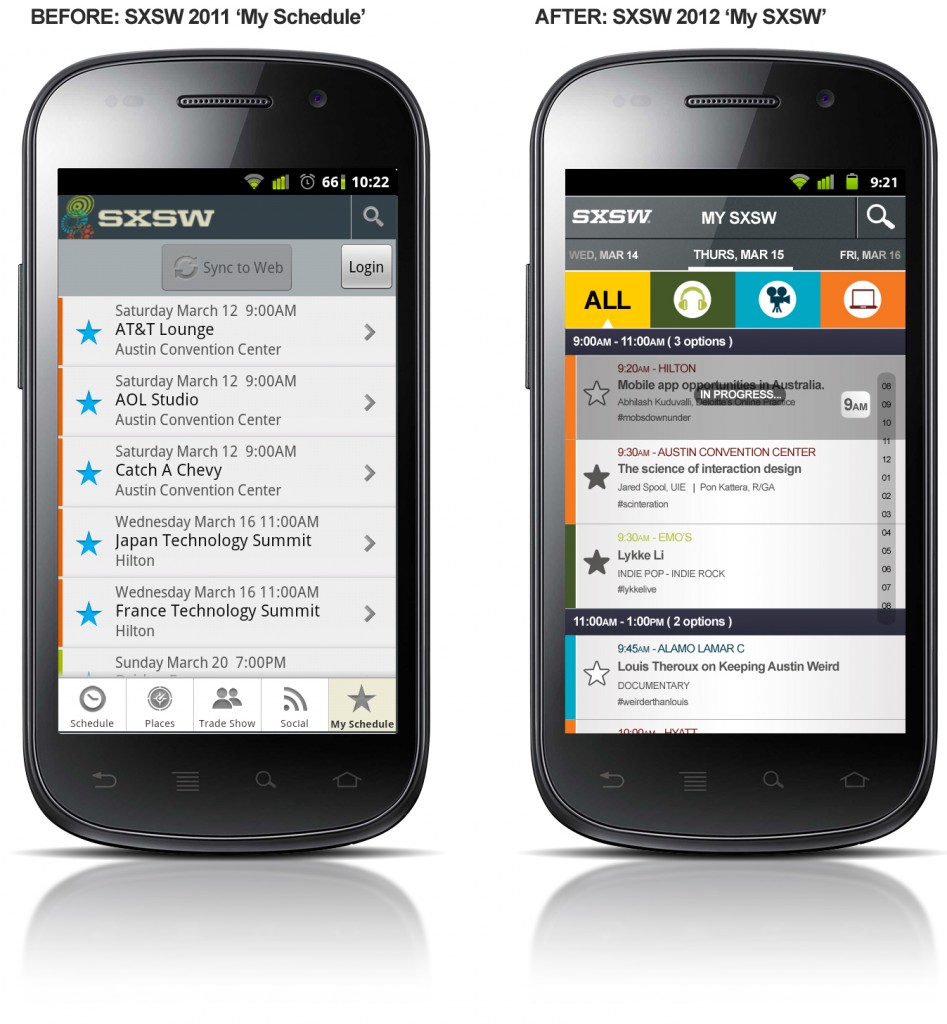
SXSW 2011 / SXSW 2012 Mobile App Schedule Interface 4. My SXSW Interface

SXSW 2011 / SXSW 2012 Mobile App My SXSW Schedule Interface

5. My SXSW - Talk Info

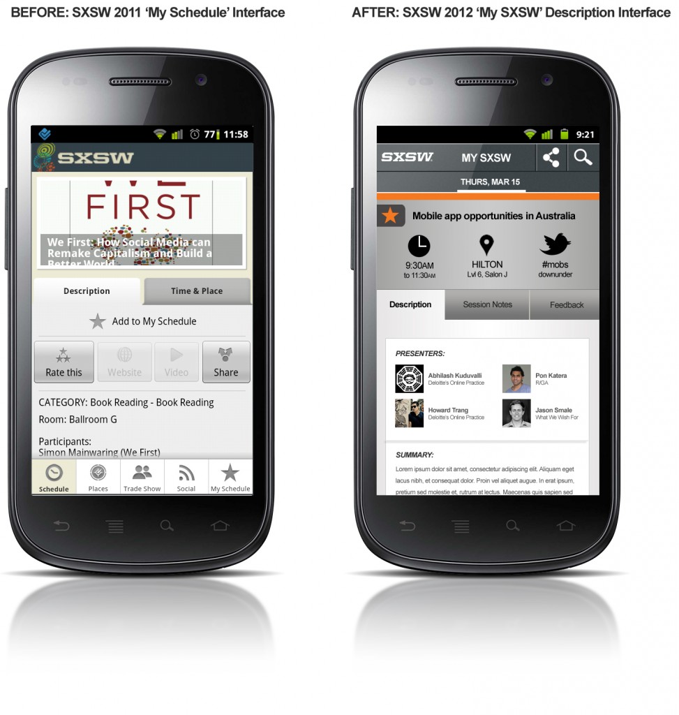
This screen is accessed when a user drills down into a specific talk from their My SXSW screen, which contains their customised/favourited list of talks.

SXSW 2011 / SXSW 2012 My SXSW Talk Information Interface

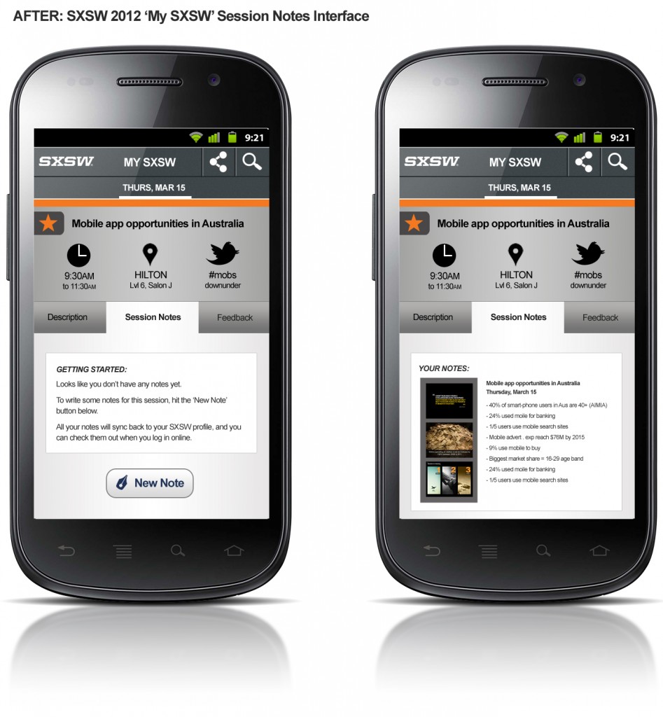
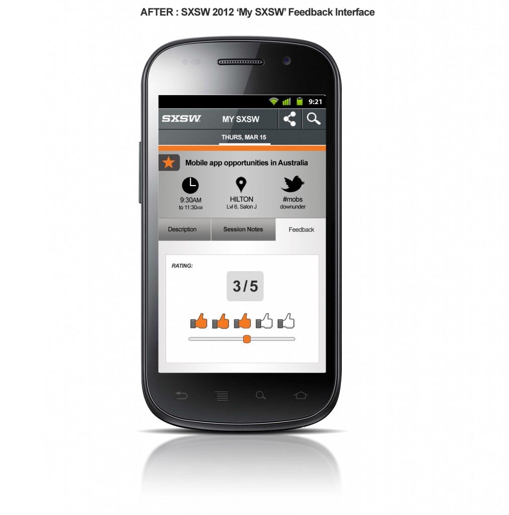
SXSW 2011 / SXSW 2012 Mobile App My SXSW Talk Info Session Notes Interface SXSW 2011 / SXSW 2012 Mobile App My SXSW Talk Info Feedback Interface

So what'd you think? 

Freshly Baked @Foursquare Ideas – Explore events

Freshly Baked Foursquare Ideas - On Exploration Read Part I of the Freshly Baked @ Foursquare Ideas series.

This is Part II of the Freshly Baked @Foursquare Ideas series. In this post, we focus on exploration...particularly around events.

Exploration (or discovery) is core to Foursquare's model. You only have to view the homepage (...Find your Friends. Unlock Your City) or play with the latest 3.0 update (which features an Explore tab) to realise the value that's been placed on exploration.

Currently, users explore via direct search or through filters (food, coffee, nightlife, shops and arts & entertainment) and the Foursquare recommendation engine returns a list of locations to the user. But whilst searching for locations is an effective means to explore a city, it's just one angle, one approach.

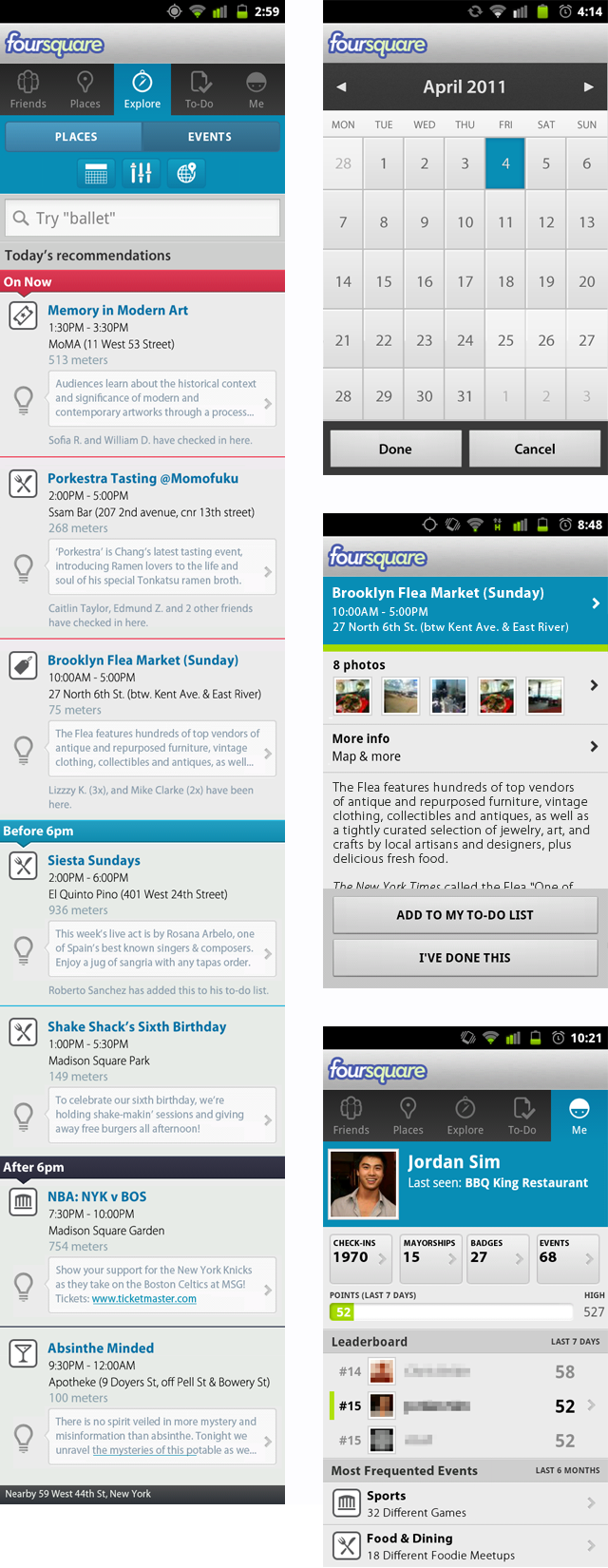
Imagine if Foursquare were to partner with an events network such as Plancast or Yahoo Upcoming. This would add a new dimension to a user's experience of exploring their city. No longer would users just explore by locations (already added in the Foursquare ecosystem), but by upcoming events (e.g. art exhibitions, flea markets, food markets, live music gigs, etc) as well.

Imagine this:

  1. You're in New York City and you have nothing planned for Sunday.
  2. You load the Foursquare app to explore what's happening.
  3. You're presented with a list of events on Sunday along with their opening hours and tips.
  4. You see that the Brooklyn Flea Market is open till 5pm, at Williamsburg, Brooklyn. You also notice that four of your Foursquare friends have already been there.
  5. Finally you read the tip, "Check out the bank vault whilst you're there...you'll be in for a treat!".
  6. You add this to your to-do list, throw on a jacket and head out to check the markets.

Exploring by events...A simple, yet a new and powerful way to explore a city. No longer will you miss out on an event of interest to you. No longer will you have to read another pocket-size pamphlet or visit another external website to list upcoming events. The beauty with this solution is that the entire exploration experience from planning to physical check-in is all contained seamlessly within one convenient environment for the user: the Foursquare app.

Below is just a sneak preview of the Foursquare Events prototype I've been developing. I've viewed the 'Events' feature as an entirely new Foursquare product offering and have thought through some of the workflows.

What do you think?

Foursquare Explore Feature - Designed by Jordan Sim

Qantas Boarding Pass: Redesigned

Qantas Icon

Over the past 7 weeks, I've spent more time in the airport than in my own bed at home. What this has resulted in, is me becoming a faux-quasi-David Attenborough of the airport landscape -  I've accrued many hours just observing how passengers (including myself) interact with boarding passes. In User Experience (UX) land, we call this engaging in 'experience research' or 'ethnographic research', i.e. watching human behaviour towards a product/service to gain insight on how users interact with it (and how they don't interact with it). My finding? Current-day boarding passes aren't designed to be passenger friendly.

In this post, I will only be focusing on Qantas' boarding passes (I'm loyal to this carrier). But whilst I'm isolating Qantas, I can guarantee that it's a universal design problem across all carriers - just have a look at Boarding Pass/Fail by @tyler_thompson. I was introduced to this site by @jwswj after I had completed my re-design (see footnote).

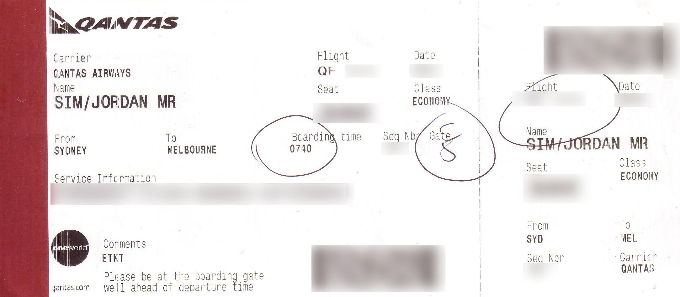
Current Design

Redesign

My thoughts on the Current Design vs. Redesign

The placement of information in the current design lacks a natural logical flow

Many of the passengers I observed struggled to easily find their departure gate and boarding time from their boarding passes. Older-aged passengers called on the assistance of their travel companion, whilst younger-aged passengers took on average, roughly about 3 seconds to achieve this task.

I believe that this struggle is due to the lack of a natural logical flow of information in the boarding pass design. Adopting a Western-world reading pattern (from left to right) for the boarding pass, the string of information on the boarding pass can be read as:

The Carrier is Qantas Airways for Flight QF123 leaving on 15 June for me, the passenger,Jordan Sim. I will be seated in 31F in economy class travelling from Sydney to Melbourne and this flight has a boarding time of 7:40am with a sequence number of A123. I have to board at Gate 5 and my service information is Frequent Flyer Bronze QF1234567.

This string lacks a logical flow and the pieces of information do not harmoniously sit together to be easily memorised. Information accessibility is poor. Now compare this to the redesigned boarding pass:

I, Jordan Sim, the passenger, am travelling from Sydney to Melbourne on Flight QF433 on 06 June. I will board at Gate 5 at the time of 3:10pm. When I'm on the plane, my seat number is 39F.

Reading the redesigned boarding pass is easy - the pieces of information harmoniously work together to form a comprehensive string. In other words, the information is easily accessible.

The key difference is that the boarding pass has been designed through the eyes of the passenger (i.e. the customer). The information on the boarding pass directly mirrors the physical boarding process. It begins with the passenger travelling between 2 locations via a plane. The plane departs on a certain date from a certain gate at a certain time. Once the passenger has passed the gate, they  have a seat on the plane.As such, it can be seen that customer interactions have been considered in the design of the new boarding pass. This makes it passenger friendly.

</rant>

What are your thoughts/opinions?

Add your comments below :)


FOOTNOTE: Whilst I am glad to know that I share a similar opinion as the UX experts towards boarding pass designs, I am simultaneously flat as my designs look similar to Tyler's even though they were designed completely independent of his.

@McDonalds 2.0 – The McCustomer Experience

McDonalds Checkout ChickTwo weeks ago, @jwswj and @dkeeghan brought me to McDonald's on Bourke St, Melbourne and introduced me to the 'new' in-store touch screen ordering system. Let me just say, I was thoroughly impressed - it's clean & simple, user-friendly, interactive, intuitive and fun.

In short, I had an awesome customer experience.

It's not new technology. But it's application is exciting and definitely game changing. Here's a quick video to wet the appetite.

What makes this so good?

  1. Order Accuracy What's the number one issue surrounding meal ordering? Order accuracy. How many times have you asked for a burger without pickles or mayo, only to have it returned with pickles or mayo or both? How many times have you ordered something extra, only to find out it's not in the bag? There's a disconnect between the customer's requirement, the clerk's interpretation and the chef's instructions.With this in-store kiosk, customers directly communicate their requirements (customised meals) to the kitchen. A customer who receives an accurately prepared order is a happy customer.
  2. Ordering Experience Customers interact with McDonald's products via imagery as opposed to text - large-sized images of each product are displayed on screen for users to select. There's tabbed navigation that organises the products into high-level categories - Favourites, Deserts, Drinks, etc. Smooth fading transitions and subtle animations are triggered whenever the customer interacts with the system, creating a seamless and somewhat perceived effortless experience. Simply, it makes you want to play more with the system (and hopefully order more?).
  3. Accessibility Firstly, the kiosks are physically accessible to short or wheel-chair bound individuals. Secondly, the User Interface (UI), predominantly consists of large icons, buttons and textual descriptions, ensuring technical accessibility.
  4. Less Queue Time Harry Balzer, VP for food market research firm NPD Group Inc stated: "It's about time and lines". Today we are looking for the easiest, quickest and most convenient ways of feeding ourselves. Why wait 5 minutes in a queue before placing your order when you can walk up to a kiosk, place an order and pick it up 2 minutes later? A customer who waits less is a happy customer.

So what's the McCustomer Experience?

For me, the McCustomer Experience is the harmonious operation of the 4 previously identified factors. I believe this is the case, because when you examine the 4 components through a collective lens (examining them as a group), they cover an end-to-end ordering process - from pre, during and post-order. The total McCustomer Experience is the sum of all of its working parts. As Christa Small, the McDonald's director who headed testing for this system, said:

"The customer perception is that it's a better experience. It's the perception that you have control over the process."

Now that you know of this new ordering system, go out and find one to play with.

Hit me back with a comment and let me know what your McCustomer Experience is like.

User Experience (UX). Steve Jobs'ing the Newspaper Industry.

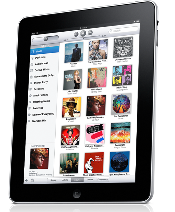
Image of Apple iPad

Over the next 5-10 years, one question will cause many restless nights for the CEO's of newspaper companies. This question, one of multi-billion dollar proportions, is:

"How can we successfully convince and convert readers to pay for online news?"

Many people think this is an impossible task, and there's evidence to prove it. The New York Times launched a subscription program called TimesSelect in 2005, charging readers US $49.95 per annum. (Non-loyal) readers proved reluctant to pay for online content and the program was abandoned in 2007.

With British newspapers, The Times and The Sunday Times, recently announcing that they will charge for online content from June 2010, I thought I'd pitch in my two cent's worth.

In this blog post,  I propose 3 ideas:

  1. The problem- Newspapers are not innovating enough.
  2. The strategy- Newspapers need to focus on their readers...not their revenues
  3. The solution- Really Rich User Experience

The problem: Newspapers are not innovating enough.

Most people think the problem is that news is free and so readily available on the web. This is what makes content so impossible to charge for online - if you can't get news from one news provider, there are many more just one click away. Additionally, there's blogs, Twitter and other social media technologies which can be leveraged for free, to obtain news and information. But these alternative are not the problem; they merely form the digital landscape which we're growing up in and currently inhabiting. More importantly, they form the baseline for all of our (user/customer) demands and expectations.

The problem is that newspapers are not innovating enough. An examination of existing and future chargeable online content offerings shows that they are nothing to be desired. In these initiatives, newspapers are re-packaging existing news services into 'sparklier' offerings and then they differentiate by the bells and whistles they hang off (more up-to-date news coverage, more images and/or more information).  In the case of The Times and The Times Select, its "video, interactive graphics, personalised news feeds and the chance to engage directly with our journalists" (James Harding, the editor of The Times). Most of these offerings we can already get on the web today. This is why newspapers have all failed in the past with charging for online content, and this is why they will fail in the future. Reinventing the wheel got nobody anywhere. The same rule applies for newspapers. If newspapers really believed in the value of their journalism, they'd provide a much superior product and service to their readers than what they area already providing.

The strategy: Newspapers need to focus on their readers...not their revenues

If newspapers really focused on their readers, they'd know that charging for online content (in the present climate) is a futile move. More importantly, they would have a better understanding of the information needs of readers today.

In no specific, order, the information needs of readers today can be distilled down to 3 key pillars:

1. Succinctness

The supply of information well exceeds our demand and consequently, we have to consciously manage the equilibrium. This balancing act is a challenge as most of us are time-poor, i.e. we don't have enough time to identify, process and consolidate information (this is one reason why RSS became popular).

We don't need more information. We don't want more information. But what we do want is information presented in a succinct-manner and then have the ability to access that information. It is maximum factual impact within minimal time (this is one reason why Twitter became even more popular).

2. User Experience (UX)

Apple is a leader in the UX market. From the time each Apple product is unpacked to the time it is retired, customers revel endlessly about their amazing experience with the product. What Apple has done is not just revolutionise the technology market, but the consumer expectation market. Consumers now demand from every new generational technology release, much more sophisticated environments and capabilities that are just as, if not even more, easy-to-use.

In addition to this, consumers want the ability to control their information. They want an information pipeline that can be tailored to their information needs and interests. It's all about personalising the user experience.

The implications of increasing consumer expectations on the newspaper industry are huge, as it creates a massive opportunity for newspaper to innovate and offer game changing products and services that will revolutionise the way we browse and consume news content.

A perfect example is the collaboration that's between occurring between Wired Magazine and Adobe to develop their magazine content on the iPad. I believe Wired Magazine will be:

1. A market disruptor within the magazine industry and 2. A market leader in shaping the way we consume print content in the future.

3. Accessibility

There are three dimensions to information accessibility:

1. Physical - Information has to be physically accessible everywhere, from the mobile to the desktop, both online and offline.

2. Time - It also has to be accessible in real-time. The quicker you have access to information, the sooner you can position yourself in front of your competitors.

3. Societal - Information also has to be presented in a manner that it does not discriminate against those mentally and/or physically disadvantaged.

The solution: Really Rich User Experience

The only way newspaper companies will be able to convince and convert online readers to pay for online news is if they completely change the way we consume news. I believe that one way to achieve this is to provide consumers with a really rich user experience.

This isn't rocket science and you'll see why in the next two scenarios.

Scenario 1: The Portable Music Industry

Just less than a decade ago, MP3 players dominated the portable audio market. They synced seamlessly with the desktop, were highly portable and allowed music to be played on the go. In October 23, 2001, Apple released the first generation iPod. It synced seamlessly with the desktop, was highly portable and allowed music to be played on the go; it provided the same services as the MP3. The technology and the functionality was not revolutionary.

What was revolutionary, however, was the way users interacted with their music content. Apple provided a completely new and refreshing user experience for managing audio content. No longer would tracks have to be viewed individually (as in the Mp3); they could be viewed collectively grouped per album or per artist. No longer would volume be increased/decreased at the press of a button; it could be increased/decreased through sliding your finger across a track pad. Apple completely disrupted the existing model of interacting with a portable music device and offered a really rich user experience. Now the Apple iPod holds over 90% of the market for hard-drive based music players.

Scenario 2: The Mobile Communications Industry

Touch-screen smartphones have been around for decades, harking back to the days when names like Palm Treo, Personal Digital Assistance (PDA) and Siemens were considered 'radical'. They were compact computers with nifty features like GPS, WiFi, calendars, calculators, notes, email and an address book. However, none of these technologies took off.

Jump forward in time by a decade - in 2007, Apple officially announced it's smart phone, the iPhone. It was a compact computer with nifty features like GPS, WiFi, calendars, calculators, notes, email and an address book amongst other things. The feature set wasn't revolutionary. What was revolutionary, however, was the way users interacted their mobile device. The iPhone user interface (UI) was sexy, intuitive and consumers became completely immersed within it (and they still are now). At the time, the phone didn't even support basic functionality such as copy and paste, or even allow for multitask processing. But users loved the really rich user experience. Now the iPhone constitutes over 60% of the Australian mobile market.

It appears that revolutionising the way we consume content and providing even richer user experiences with each new technology release is key towards shifting an entire market towards a new convention.

One idea I have of a really rich user experience that I'd like to experience in the near future is reader immersion. Essentially this is my term for virtually embedding the reader within the real-life context of the content they are consuming.

The best example I can think of is the recent events in Haiti. Our perception of the situation was only conveyed through news articles, video snippets and online photo galleries. However, each of these mediums are mutually exclusive, and as such, are unable to collectively provide a complete experience of the situation in Haiti.

Through reader immersion, I foresee technologies such as Microsoft's Photosynth and Augmented Reality being combined to provide a richer user experience. Through Photosynth, readers will be able to see a three-dimensional rendering of the environment, and they will be able to view and move around in it. Overlaying textual information, via augmented reality, within this three-dimension virtual environment enables readers to drill down to more specific news content regarding the situation. The combination of these technologies would completely immerse readers within the world of Haiti, right from their home, and would enable them to have a fuller comprehension of the situation.

Conclusion

It's not about providing more news, more video or interactive graphics. We simply don't have the time to consume more content. The existing newspaper model is bunk.

It's about disrupting the market and way we consume news content now. It's about delivering a game-changing news service with an even richer user experience than the one we have now.

If any newspaper company is able to do this, they're just Steve Jobs'ed the newspaper industry, and they've lined themselves up for the billion dollar bang.